Accessibility Best Practices for Newbies
How to be an accessibility ally from the beginning!

Howdy! I'm Claudia, an NYC-based front-end Software Engineer with experience in the healthcare and public relations industries. I specialize in front-end development and JavaScript.
Please note - this is a topic I'm continuing to learn about, even as I'm typing! Feel free to drop me a line if you'd like to add/comment/correct.
But wait! Why does this matter? Who needs this?
Anybody can be an ally in the cause of digital accessibility, including UX designers, product designers, and engineers. And why shouldn't we be? In the pursuit of building highly visible digital experiences, it's in both our and the consumer's interest to make our work as accessible as possible to our audience regardless of auditory, visual, physical, or cognitive abilities.
In this article, I'll be diving into accessibility practices as they relate to front-end development.
When I first began researching accessibility, I found the breadth of knowledge available online to be a little overwhelming, so I'd like to offer a tip: incorporate these tips (and any others you may read about) as you learn about them.
Just as you learned to code, take in these practices bit by bit. While it might not be perfect at first, your effort to become an ally is the first step in a hugely important and invaluable process.
Styling
Fonts, Colors & Contrast
Let's start small with some basic rules about fonts. At its core, every website and application contains some sort of text that tells a user what its purpose or function is. Here are some easy-to-follow DOs and DON'Ts of using fonts.
Fonts:
DON'T create text in all CAPS - this can be difficult for both the human eye and screen readers to read.
DON'T use font styles that are difficult to read.
DO use font styles that emphasize clarity and readability.
DO makes links distinguishable from the static text by underlining, bolding, or italicizing them.
DO use adequate font size - this is of course dependent on the project and aesthetics, but a good rule of thumb is to never use font sizes below 16px for important reader information.
Colors & Contrast
You should always aim to find colors that provide maximum contrast, including enough contrast between content and background so that the text is readable for anyone with low vision or color deficiencies.
As a best practice, colors should always have a color contrast ratio of at least 4:5:1.
Additionally, color should not be the only differentiator for interactive components, such as links. For example, a link or button should be stylized with additions such as borders or text decoration to differentiate them from other elements.
Another good tip to keep in mind is to avoid green text on red backgrounds and red text on green backgrounds given that red/green color blindness is the most common form of color blindness. Furthermore, avoid using red and green to signal "bad" and "good" indicators such as alerts.
HTML
Page Structure and Semantic Elements
You've most likely heard about semantic elements before. According to my holy grail, mdn web docs, semantics refer to "the meaning of a piece of code." When applied to HTML elements, semantic elements are elements whose names describe their purpose within the larger structure of the page.
Some examples are included in the code block below:
<!DOCTYPE html>
<head>
    <meta ="example">
    <title>Semantic Elements</title>
</head>
<header>
    <h1>New York News</h1>
</header>
<body>
    <main>
        <section>
            <article>
                <figure>
                    <img src="empire-state.jpg">
                    <figcaption>The Empire State Building</figcaption>
                </figure>
                    <h3>Empire State Building Turns 100 </h3>
                    <p>Fun fact about the Empire State Building...</p>
            </article>
        </section>
    </main>
    <footer>Copyright New York News 2023.<footer>
</body>
In the browser, this example would look something like this:
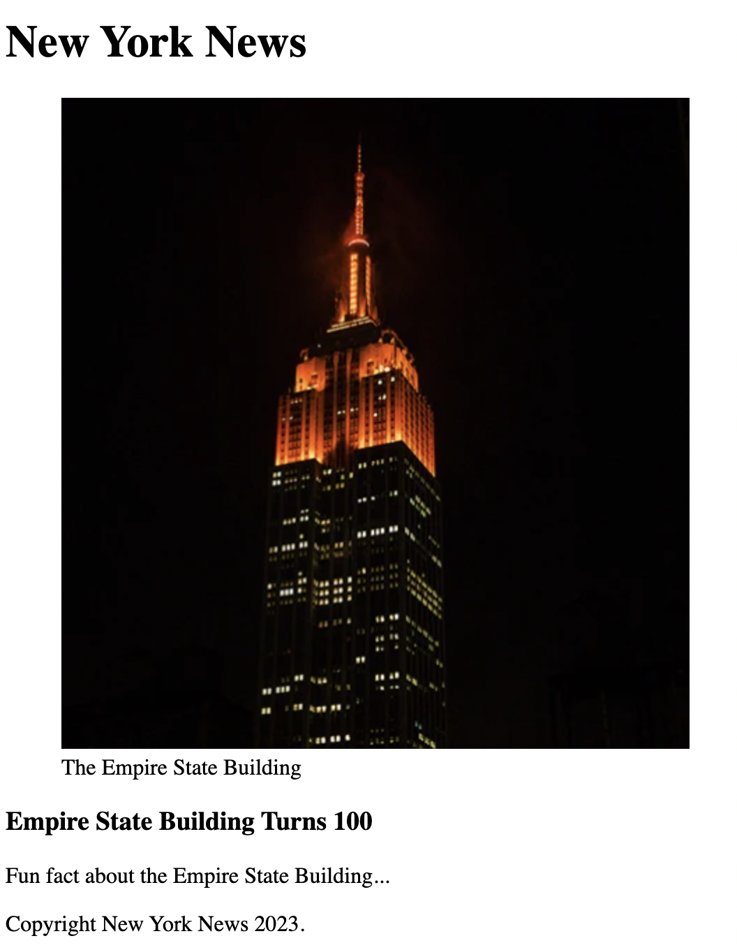
The example above is a news article for a fictional outlet called the New York News. It contains elements that you'll likely find on the front page of any traditional newspaper, including a header, an article, a figure or image that illustrates the subject of the article, and a figure caption. All of these elements describe to the browser their meaning on the page.
Semantic elements are useful not only for SEO optimization but also for those with visual impairments, as screen readers can use them as signals to help visually impaired users navigate a page.
ALT Text
Alternative text, or ALT text, describes the appearance or function of an image on a page. Alt text is read aloud by screen readers used by visually impaired users and displays in place of an image if it fails to load. It's also indexed by search engine bots to better understand the content of your page.
If no ALT text is provided, then a screen reader will only be able to say "IMAGE" or perhaps provide a file name.
Consider the following image:

If we were to write ALT text for this image, we might come up with a few different descriptions for this:
ALT= "Man sketching in an art studio".
ALT= "Man sitting on a stool in a dark art studio sketching a photo."
ALT= "Man gloomily sitting on a stool in a dark art studio sketching a photo with a charcoal pencil."
When thinking of an ALT tag, the task is to consider WHY the image is included. The answer may affect how you write the ALT text.
Accessibility Testing Tools
Please keep in mind that none of the tools mentioned below can replace or are preferable to the evaluation that can be done by the human eye - at the end of the day, humans know humans best!
Accessibility Checker is a free web-based audit tool that scans your website against major accessibility guidelines in place throughout the world. For every error the scanner finds, you'll receive a detailed explanation about it, whom it affects, and multiple options for how to solve it.
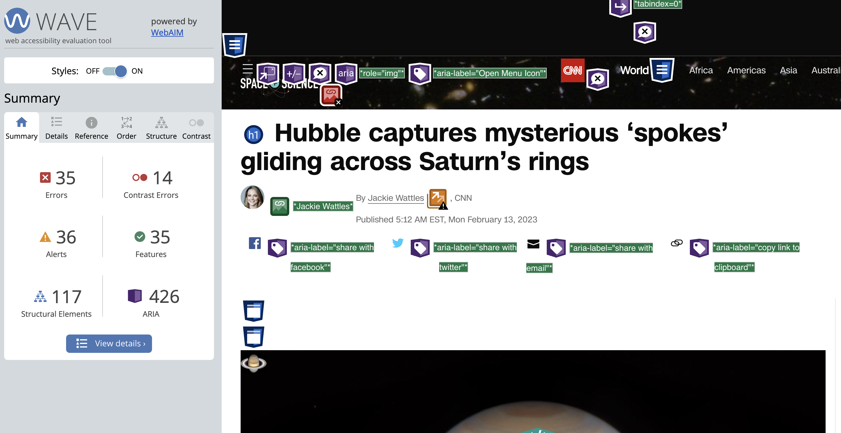
WAVE, or Web Accessibility Evaluation Tools, defines itself as a "suite of evaluation tools that helps authors make their web content more accessible to individuals with disabilities." It also offers a helpful browser plugin that allows for easy evaluation of a website in real-time - check out an example of this in action below!
Dynomapper is an all-in-one tool that generates a sitemap of your website or online application to check its web accessibility. It offers a free trial, plus paid services for individuals and organizations.
Resources & Recommended Reading
The World Wide Web's Accessibility Initiative's "Accessibility Fundamentals Overview"
Smashing Magazine's "A Complete Guide To Accessible Front-End Components"
UX Collective's "Accessibility patterns all front-end developers should know"


